The final project was to make a portfolio showcasing all the projects I made during the semester. I made this portfolio using InDesign. I had initially sketched a completely different cover, but as I began working I came up with a new cover idea. The idea for the cover was inspired by the Creation of Adam by Michelangelo. The painting of the Creation of Adam depicts an image of God stretching out his finger to give Adam a spark of life. However, in my version, I am reaching out to touch the mouse I used to make the projects this semester. I made the image using Illustrator. I then added a cloudy background to match the heavenly scene within the original artwork.
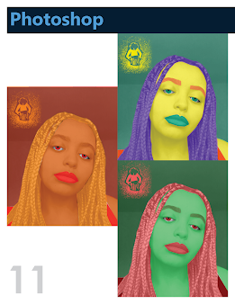
The next two pages welcome and introduce me to the reader. I used the colors within the portrait of myself to color the font on the welcome page and the two squares on the corners of my portrait. The index pages utilize the cloudy sky background and layout the sections according to the Adobe software I used. The common theme among my pages is that each page is titled with the software I used but the colors switch to match the color of the software. The project is on the left page and the artist statement is on the right along with sketches or inspiration images. The title of the project is also placed on the right page colored in the same color as the software title. Each page also has the page number in the corner in a light grey color.
I experimented with different text wraps and layouts for each page. For example, the personal logo page has my sketches on the edges of the page and my artist statement within the middle of the. However, my b&w to color page uses two columns, and my b&w photo is placed right after the sentence where I mention it and my color themes are placed at the end of the second column. My back cover page is the cloudy background used on the front and index page and the contact information I used in my business card is placed in the lower-left corner of the page.
Inspiration:


Your work was consistently my favorite in the class (especially your propaganda poster), and this portfolio showcases it exceedingly well. Your front cover is creative and engaging, and your page layouts are stimulating without seeming overcrowded. Overall, excellent job, and I know you'll continue putting forth amazing work in the future!
ReplyDelete